University of Pittsburgh’s Orientation Week
PUBLICATION DESIGN & EVENT MARKETING
Hail to Pitt!
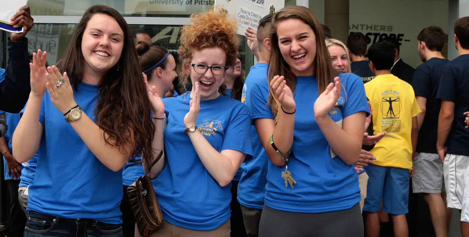
Pitt's 2016 Orientation was a momentous occasion — welcoming in more than 4,000 students through a weeklong event of 140+ programs. The dynamic array of events engaged students in the campus community and generated interest in activities.
My thought-out execution was playful in styling — a pop-art appeal mixed with shape/framing inspiration taken from the University’s iconic and ornate Gothic structure, the Cathedral of Learning.
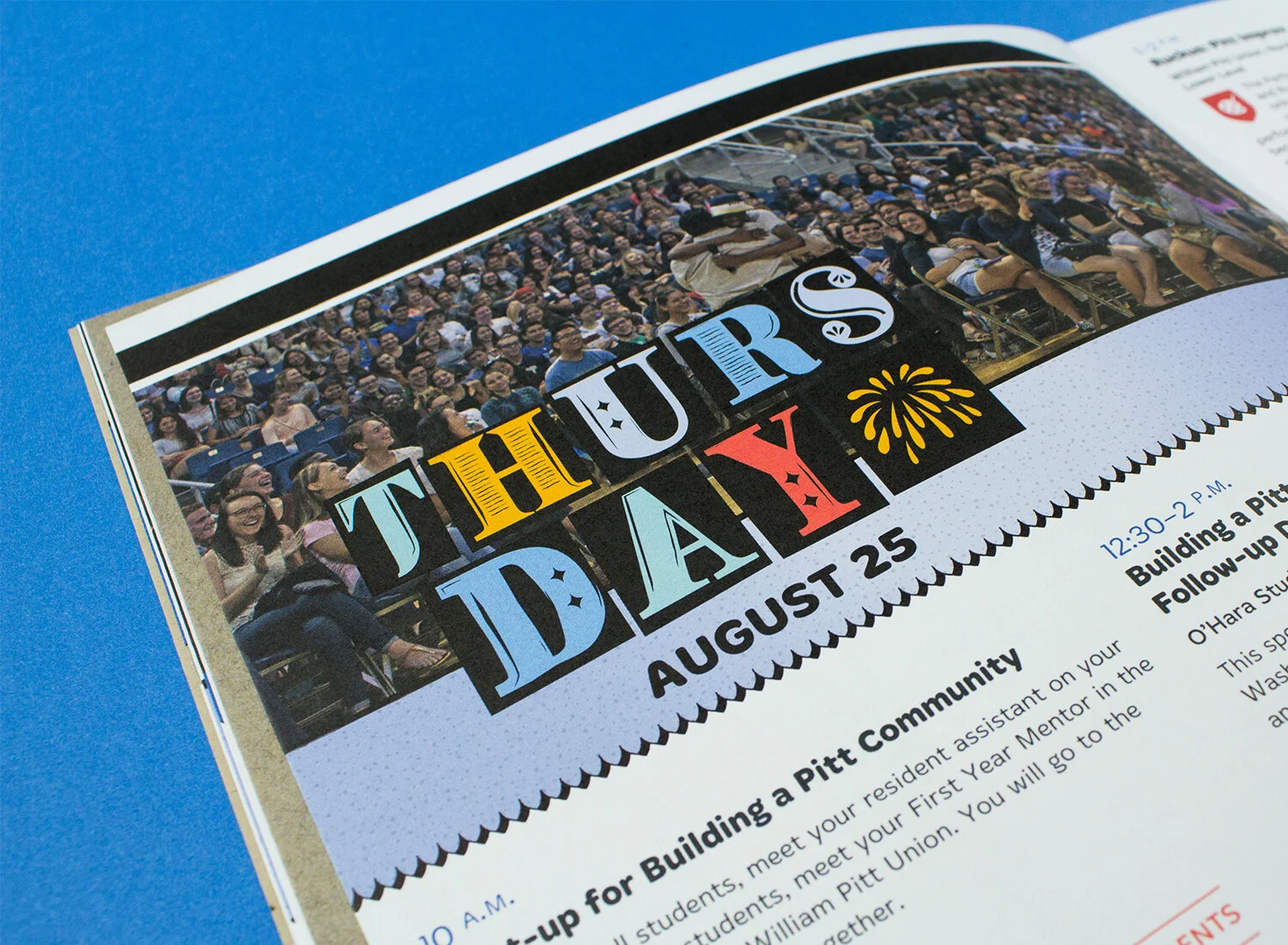
The print suite of materials included an invite to parents to family events, a mini schedule-at-a-glance, and a full book of activities.
Pitt’s traditional blue and gold headed a refreshing color palette that included lively pastels and the mixed-media inclusion of textured brown butcher paper.
My custom alphabet of drop caps, a contemporary twist on the Renaissance storybook, delightfully built the titles for each day of Orientation.
The full cover spread of the Orientation Week guide


