Wedding Stationary
“Make it pink. No, make it blue.” — Make it both!
INVITATION DESIGN
Light yet bright!
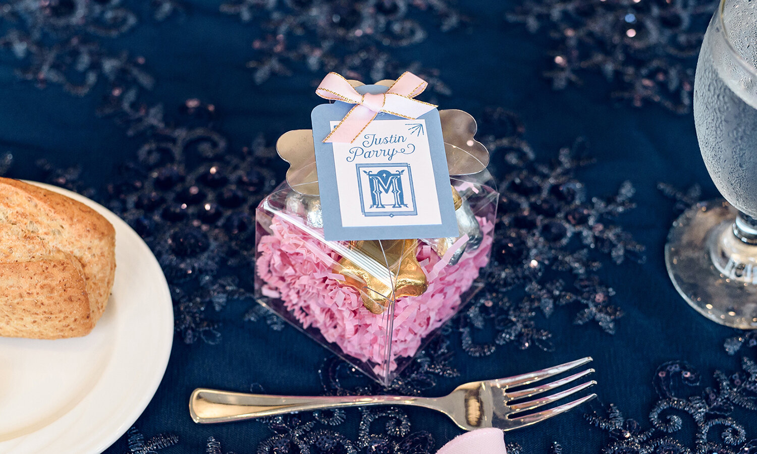
2019 Set — With a mood board consisting of mostly images from Walt Disney’s “Sleeping Beauty,” this double duty bride and designer AWOKE my own wedding dreams. With romantic script for titles (Harman), the limbs of characters curl and blossom, achieving a soft blend of organic nuisances paired with straight-line framework. My long-coveted palette of pink, blue, periwinkle and metallic gold swept all the details.
The Wedding Emblem: I drew the signature mark for the event, our last name initial “M”, to look like the center of a garden gate or castle stain glass window — once again striking that balance between curves and straight lines (a feminine and masculine meeting). This mark adorned and further inspired the detailed elements of the day!


The graphic elements were inspired by shapes within the masonry — half-circles and sharp peaks.
2016 Set — The couple chose a dramatic and historic venue — the New Hazlett Theater in Pittsburgh, over 120 years old and constructed in the architectural style of Romanesque Revival. Being that the bride and groom met through improvisational theatre in Chicago, yet both happen to be from Pittsburgh, the setting and occasion held extra special meaning. The event colors selected were sparkling sapphire and gold with accents of a dreamy powder blue. The graphic elements were inspired by shapes within the masonry — half-circles and sharp peaks. The two typefaces selected, headline script (Rokula) and copy sans serif (Darwin), are both theatrical in nature, with cunning curves and quaint arms and legs.
The Wedding Emblem: The couple’s mark shares a geographical journey— a full circle through iconic landmarks. “From Pittsburgh (hometown) to Chicago (new home/meeting place) and back (wedding location/forever home)” is presented through a Pittsburgh bridge holding the John Hancock Center, with a PPG Place tower inside. The triangle peaks and valleys in a ribbon around the mark are inspired by the pattern work around The New Hazlett’s signature lunette window.
This mark translated well into gold sticker seals and a classic matchbook favor.


